This theme is based on a Material Design Framework. Please check the video to understand more:
This means that a same color is applied to multiple elements, and sometimes is not possible to assign a specific color to a specific elements without changing other parts of the site.
This is called a color pattern, and this is the standard way Material Design works, to maintain a harmony between the elements and provide a consistent color pattern.
You can calculate cool color palettes on websites like:
- http://paletton.com/
- https://coolors.co/browser
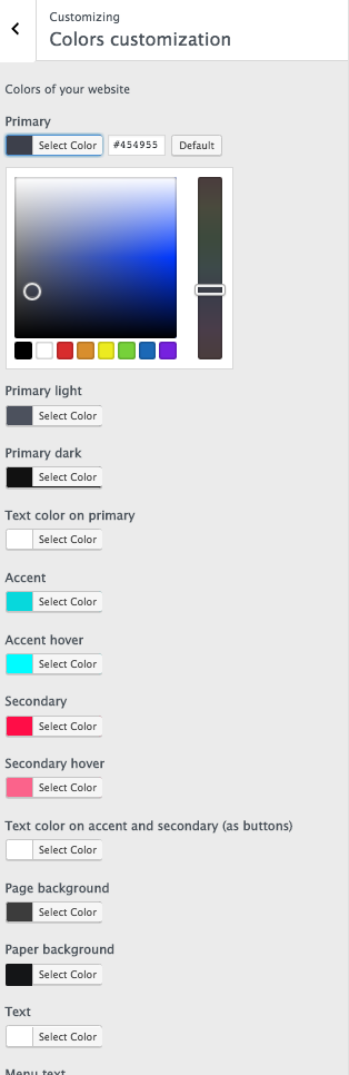
Important notes on how to choose your colors:
- You should choose contrast colors as Primary, Accent, Background and text, to make the different areas of the page recognizable.
- You can’t choose as Accent and Secondary the same color as otherwise your background buttons and links will disappear
- Prefere dark colors as Primary colors
- Choose similar colors as primary light and dark
- Choose similar colors as page background and paper background
- Choose a high contrast colors as text background compared to page and primary
- You can’t have a “chess” design (black background and white paper or opposite) as text may fall on background or on paper. The Page Background and the Paper background have to be similar.
For a light scheme you can choose grey as page background, white for paper and black for text. - Accent and secondary: those colors are for interactions. Do NOT choose black or white as accent or secondary as they won’t be visible!! You should choose bright colors as your accent and secondary for a good usability.
If you have troubles choosing your website colors, please check the Material Colors video and links provided above.