
The menu bar is responsive.
In tablets and mobile, the horizontal menu items will move to the Off-Canvas sidebar.
You can use the Menu editor in Appearance > Menu to set a menu in the main bar.
In Menu > Locations set the menu as Primary. This menu supports 3 levels of depth.
Mega menus setup is explained under the chapter Mega Menu of this manual. Sub-items of a link with mega menu will be visible only in tablet and mobile.
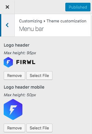
Logo
We suggest uploading 2 different logos for desktop and mobile. In mobile, a squared logo is recommended, as the space is very limited. PNG with transparent backgrounds will work better than JPG or GIF.
Right-side buttons
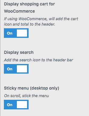
There are 4 available right-side buttons:
Cart button
This option will only appear if you have WooCommerce plugin installed
Search Button
Will work both in desktop and mobile, displaying a header search field.
Menu off-canvas button
This button appears automatically:
- In desktop, if there are widgets in the Off Canvas sidebar, or a specified Off Canvas Menu Desktop
- In mobile, will appear by default (requires a menu set as Primary Menu location)
You can choose which menu to place in the menu bar in Appearance > Menu > Locations and set it as Primary menu.
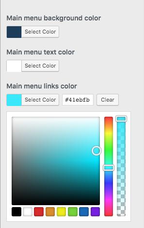
Menu Colors
You can override the global settings and set custom menu bar colors.